

Good Design Vs Good Product Experience
Published: 24.08.26 ·
last updated: 25.08.26 ·
by Tech it!
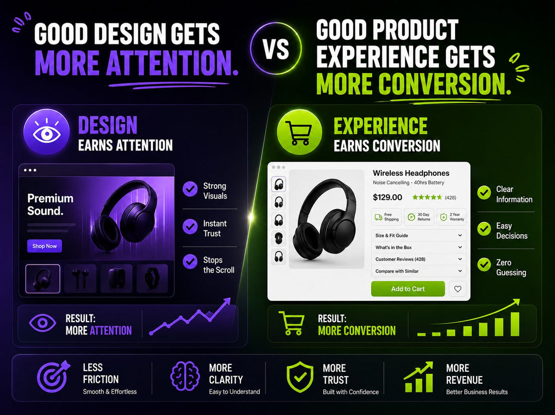
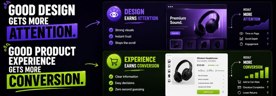
Why Attention Doesn't Always Lead to Conversion?
A designed website isn't the same thing as a website that converts well. Most teams treat those as one problem handed to one person at one stage of the project. They're not the problem and mixing them up is one of the more expensive mistakes we see in eCommerce.
Design Earns Attention. Experience Earns a Decision!
Good visual design genuinely does work. Research from Carleton University found that web users form an impression of a page's visual appeal in as little as 50 milliseconds, well before anyone read a word or scrolled. That snap judgment sets the tone for everything after it. Plenty of conversion is lost before it ever had a chance simply because a site looked unfinished or hard to trust in that instant.
Attention isn't the same currency as conversion. Getting someone to stop scrolling is a design win. Getting them to actually decide, with confidence that this product is right for them. That's a product experience win and it comes down to clarity sequencing and how much thinking the user has to do between "I like this" and "I'll buy this."
A page can look great. Still ask too much of someone at the exact moment they're closest to converting.
Where the Two Get Confused
Here's a pattern that comes up a lot: a redesign ships the site looks sharper engagement metrics tick up. Time on page more scroll depth, more photo views. And the team reads that as a win. Then conversion doesn't. Barely does.
Usually what happened is the redesign optimized for attention without touching the decision-making burden. The hero image got bigger. The typeface got premium. But the information someone actually needs. Price context whether it'll fit what makes this different from the eleven identical options on the page. Never got any clearer. The site got more attractive without getting easier to decide on.
These are worth pulling apart, because different levers move each one:
Design (attention) |
Product Experience (decision) |
|
| Goals |
Get noticed, build trust fast
|
Reduce effort to decide
|
| Signals |
Time on page, scroll depth, bounce rate
|
Add-to-cart rate, checkout completion, return rate
|
| Fails when |
It looks generic or untrustworthy
|
It looks great but leaves the user uncertain
|
| Fixed By |
Visual hierarchy, imagery, typography
|
Information sequencing, comparison clarity, decision support
|
A Concrete Version of the Problem
Picture a product page with sharp photography, a clean layout, strong brand voice. Genuinely solid design work.. The size guide sits in a separate tab someone has to think to click. The reviews that would actually settle a question are three scrolls down.. Nothing on the page explains what makes this product different from the near-identical one in the same collection.
None of that is a design failure exactly. Nothing here looks bad.. Each of those gaps adds a sliver of doubt and doubt at the decision point is exactly where conversion quietly leaks. Without tripping any alarm in the analytics because the page is still "performing" on every metric anyones actually watching.
Why This Matters More at the Margin
Most sites past a baseline level of polish aren't losing conversion because they look bad. They're losing it because looking good became the finish line and the harder visible work. Making the decision itself easy. Never got its own pass.
This isn't a case against investing in design. It's that design and product experience are disciplines with different success metrics and a project that only budgets for one plateaus. A store can come out of a redesign looking better and convert at basically the same rate because the thing standing between a visitor and a purchase was never how the page looked.
How We'd Approach This in Practice
Instead of asking "does this look good " the more useful audit question is: at each point on this page does the user have what they need to move forward or are they being sent off to go find it?
That means walking the page the way a time-undecided visitor would, not the way someone already sold on the brand would and flagging every spot where a decision-relevant question. Fit, differentiation, trust, urgency. Gets answered somewhere other than exactly where its needed.
It's a lens than a design review and it tends to surface a different set of problems: smaller less visually obvious, usually cheaper to fix than a redesign because the layout itself doesn't need to change. Whats usually missing is information, sequencing or emphasis. Not aesthetics.
If your last redesign moved engagement but not conversion that gap is worth a look. It's rarely the visuals. It's always whats happening in between them.
FAQs
If a redesign doesn't move conversion does that mean the design was bad?
Not necessarily. A redesign can improve every metric (trust, polish, brand perception) and still leave conversion flat if the underlying decision-making friction, like fit, differentiation or comparison was never addressed.
How is a product experience audit different from a UX or design review?
A design review typically asks whether a page looks right. A product experience audit asks whether a time undecided visitor has what they need to decide at each point on the page. It's a narrower decision-focused lens rather than a general usability pass.
Does this mean visual design doesn't matter for conversion?
No. Design still does work, particularly early in a session by building trust and keeping people from bouncing. The point isn't that design is unimportant it's that it solves a problem than the one that happens right before someone decides to buy.
What's usually the fix once a decision-friction gap is found?
Often it's smaller than expected. Surfacing a size guide inline of, behind a tab or stating a products key differentiator directly on the page. Since the layout rarely needs to change only what information is visible and where.


