

Sticky ATC: CRO Hack or UX Nightmare?
What Is a Sticky Add-to-Cart Bar, Exactly?
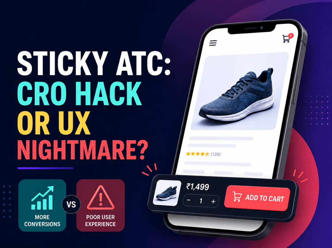
A sticky add-to-cart bar is a fixed strip, usually anchored to the bottom of the screen, that keeps the product name, price, and add-to-cart button visible as a shopper scrolls through the rest of the page. Instead of the button disappearing once someone scrolls past it to read descriptions or reviews, it stays within reach the entire time.
On mobile especially, this solves a real, specific problem: the standard add-to-cart button usually lives near the top of the page, and mobile screens are small enough that scrolling past it happens almost immediately.
Why Do Teams Add One in the First Place?
The logic is straightforward. A shopper reads through a product page, checks images, maybe reads a few reviews, and decides to buy, but by that point they're several scrolls away from the original button. Getting back to it means scrolling up, which is a small amount of extra effort at exactly the moment someone was ready to act. Every extra step in a purchase flow is a chance for that intent to cool off or get interrupted.
A sticky bar removes that step entirely. The purchase action is always one tap away, regardless of where someone is on the page.
Does the Data Actually Support It?
Here it's worth being careful about sourcing, because a lot of the numbers circulating for sticky ATC come from companies that sell sticky-cart apps or plugins, which have an obvious reason to report the largest possible lift. Some of those figures claim conversion improvements as great as 15%, but they're rarely independently verified.
The more credible evidence comes from independent CRO agencies running controlled tests rather than tool vendors reporting their own product's results. One test run by the agency GrowthRock on a mobile ecommerce site found a sticky add-to-cart button led to a 7.9% increase in completed orders at 99% statistical significance. A separate test run by Traction Marketing on a different store found a more modest but still real effect: a 2.74% uplift in conversions, with an 82.7% probability that the sticky variant outperformed the control.
Those two numbers don't agree with each other, and that's the honest takeaway: the effect is real and directionally positive in tested cases, but the size of the lift varies a lot by store, catalogue, and implementation. Anyone quoting a single confident percentage for "what sticky ATC does to conversion" is oversimplifying a genuinely mixed body of evidence.
Where Does Sticky ATC Go Wrong?
The UX complaints aren't imaginary. A few failure patterns show up repeatedly:
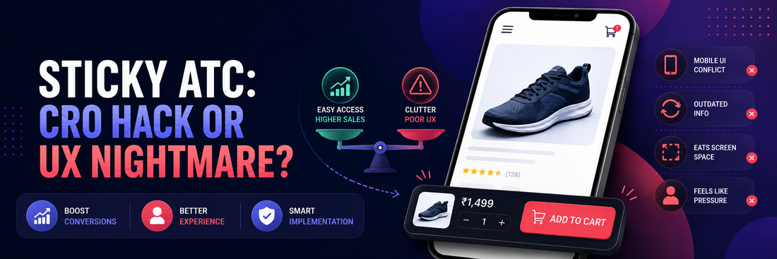
- It fights with the phone's own interface. On some devices, especially with browser navigation bars visible, a sticky bar can overlap system UI elements, creating a genuinely broken or hard-to-tap experience.
- It goes stale. If a shopper changes size, color, or quantity elsewhere on the page and the sticky bar doesn't update, they can end up adding the wrong variant without realizing it.
- It eats screen space on an already small display. A permanent strip at the bottom of a phone screen is real estate that isn't available for content, and on long, image-heavy product pages that trade-off is more noticeable.
- It can read as pressure rather than convenience. A bar that feels aggressive, or that appears the instant someone lands on the page rather than after they've engaged with content, starts to resemble a pop-up more than a helpful utility.
None of these are arguments against the concept. They're arguments against sloppy implementation.
So Is It a Hack or a Nightmare?
Neither, on its own. The honest position is that sticky ATC is a mechanism, not a strategy — it removes one specific kind of friction (distance to the buy button) and does nothing about any other kind. If a product page's real problem is that people don't trust the product, aren't sure about fit, or can't tell it apart from a similar item in the same collection, a sticky button won't fix any of that. It'll just make it slightly faster for someone to abandon the process if they were going to anyway.
Where it earns its place is on pages where purchase intent is already reasonably strong, and the main obstacle really is the physical distance between "I've decided" and "I can act on it." Where it becomes a nightmare is when it's treated as a substitute for fixing an actual product page problem, or when the implementation itself is broken.
What Would We Test Before Rolling This Out?
Rather than assuming either outcome, we'd want to see scroll depth on the product page, current add-to-cart rate relative to scroll depth (how many people who reach the point where the button disappears actually come back to use it), and mobile bounce or exit rate on longer product pages. If a large share of engaged sessions never make it back to the add-to-cart button, that's a reasonable signal that a sticky bar could help.
From there, we'd test it directly — sticky bar as the variant against the current static layout, watching add-to-cart rate, checkout completion, and mobile bounce rate specifically, rather than assuming the result before running it.
Pros and Cons of Sticky ATC
Pros
- Removes a small but real piece of friction for shoppers who have already decided to buy
- Particularly useful on mobile and for long, content-heavy product pages where the standard button disappears quickly
- Low-risk to test, since it's an isolated, reversible change rather than a structural redesign
Cons
- Can visually conflict with browser or device UI on some phones if not implemented carefully
- Needs to stay in sync with variant selection, or it risks capturing the wrong size, color, or quantity
- Does nothing for the actual reasons someone might be hesitant to buy — trust, fit, differentiation — and can mask those problems rather than solve them
FAQs
Does a sticky add-to-cart bar always improve conversion?
No. The tested effect is generally positive but varies significantly by store and implementation — some independent tests show a meaningful lift, others a much smaller one. It's worth testing on your own traffic rather than assuming a result.
Is sticky ATC more useful on mobile or desktop?
Mobile, generally. Small screens mean the standard button disappears almost immediately after a small amount of scrolling, which is the exact friction a sticky bar addresses. On desktop, the button is often still visible for longer, so the benefit is smaller.
Can a sticky add-to-cart bar hurt conversion?
Yes, if it's implemented poorly — overlapping device UI, showing outdated variant or price information, or appearing so aggressively that it feels like a pop-up rather than a convenience.
Should every product page have one?
Not necessarily. It tends to matter more on longer pages with meaningful scroll depth. A short product page where the button is still visible or close by after scrolling has less to gain from it.
Sticky ATC isn't the hack some teams treat it as, and it isn't the UX crime others make it out to be. It's a small, testable fix for one specific kind of friction, worth trying where that friction actually exists and worth skipping where the real problem lies somewhere else on the page.


